California is not just a place; it is an aesthetic. From the misty redwood forests of the North to the sun-drenched beaches of the South, the Golden State commands a unique visual language. When homeowners in California decide to upgrade their exteriors, they aren’t just looking for durability—they are looking for a style that resonates with the landscape and the relaxed, sophisticated lifestyle of the West Coast.
James Hardie fiber cement siding has become the premier choice for California renovations, primarily due to its resistance to wildfires and harsh sun. But beyond performance, James Hardie offers a curated palette of colors through its ColorPlus® Technology that perfectly captures the California vibe.
Choosing a color for your home is a massive commitment. It defines your curb appeal for decades. Whether you own a Craftsman bungalow in Sacramento, a Mid-Century Modern gem in Palm Springs, or a coastal cottage in Monterey, the color you choose must bridge the gap between your personal taste and the architectural heritage of your neighborhood.
In this comprehensive guide, we will explore the most popular James Hardie siding colors specifically for California homes. We will break down why these shades work, which architectural styles they suit best, and how they interact with the unique California light.
The California Palette: Why It’s Different
Exterior design in California differs significantly from the rest of the country. While the East Coast leans heavily into traditional colonial whites and historic reds, and the South embraces beige and peach tones, California favors a mix of earthy neutrals, crisp modern contrasts, and nature-inspired hues.
Three main factors drive color trends in California:
- The Light: California sunlight is intense and warm. Colors that look subtle in Seattle or Chicago can look washed out or blindingly bright in California. Homeowners here tend to gravitate towards colors with complex undertones that hold up under bright sun.
- The Landscape: Whether it’s the golden hills of the dry season, the deep greens of the Sierra, or the blues of the Pacific, California homes often aim to harmonize with their natural surroundings rather than compete with them.
- The Architecture: The state is a melting pot of styles—Spanish Revival, Victorian, Craftsman, Ranch, and Modern Farmhouse. Each style dictates a different approach to color.
Let’s dive into the top trending colors that are defining California neighborhoods right now.
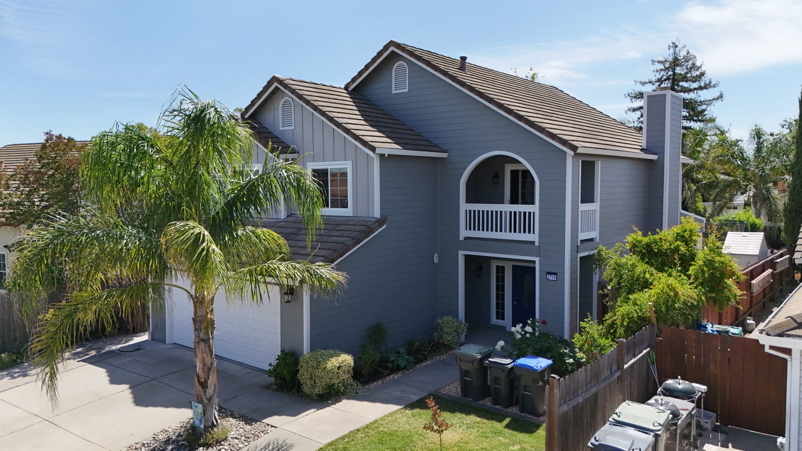
1. Arctic White: The Modern Farmhouse Essential
It is impossible to discuss California trends without starting with Arctic White. This is, without a doubt, the reigning champion of exterior colors across the state.
The Aesthetic
Arctic White is not a creamy off-white or a beige-white; it is a crisp, clean, pure white. It reflects the sun brilliantly, making a home look fresh, new, and immaculate. In the bright California sun, it dazzles without looking sterile, thanks to the high-quality finish of ColorPlus® Technology.
Why It’s Popular in California
The explosive popularity of the “Modern Farmhouse” style has driven Arctic White to the top of the list. Drive through any renovated neighborhood in California, and you will see the formula: Arctic White types of James Hardie siding (often board-and-batten) paired with black window frames and a dark roof. This high-contrast look is quintessential California cool.
Best Architectural Fit
- Modern Farmhouse: The standard-bearer.
- Spanish Revival: While stucco is traditional, homeowners switching to HardiePanel® with a stucco texture often choose Arctic White to mimic the classic whitewashed adobe look.
- Coastal Contemporary: It mimics the clean, breezy feel of a beach house.
2. Iron Gray: The Bold Modernist
For homeowners who want to make a statement, Iron Gray is the top choice. This is a deep, dramatic, moody gray that leans almost into charcoal. It commands attention and exudes sophistication.
The Aesthetic
Iron Gray is bold but neutral. It doesn’t have strong blue or green undertones; it is a true, dark gray. It provides a stunning backdrop for landscaping. Green foliage, bright flowers, and natural wood accents pop incredibly well against a dark facade.
Why It’s Popular in California
California architecture often embraces modernism. Iron Gray highlights the geometry of a home. It makes a house look grounded and substantial. In urban areas like San Francisco or Los Angeles, where lots can be smaller, a dark color can actually make a home recede visually, feeling less imposing while looking incredibly chic.
Best Architectural Fit
- Mid-Century Modern: Dark exteriors were a staple of this era, and Iron Gray revitalizes that look.
- Modern Ranch: It transforms a dated 1970s ranch into a sleek, contemporary estate.
- Urban Lofts/Townhomes: It offers an industrial edge that fits city living.
3. Cobble Stone: The Warm Neutral
California is the land of “greige” (gray-beige), and Cobble Stone is the perfect embodiment of this trend. It is a taupe-based neutral that is warmer than a cool gray but more sophisticated than a builder-grade tan.
The Aesthetic
Cobble Stone feels organic. It mimics the color of weathered stone or dry earth. It is soft, inviting, and incredibly versatile. It is the “Goldilocks” color—not too dark, not too light, not too cold, not too warm.
Why It’s Popular in California
This color harmonizes beautifully with the golden, dry landscapes typical of California valleys and foothills. It doesn’t clash with the dry grass in summer or the oaks in winter. It is also an excellent choice for HOAs that have strict rules about “earth tones” but where the homeowner still wants something elegant.
Best Architectural Fit
- Craftsman Bungalows: It pairs beautifully with white trim and natural brick or stone bases.
- Traditional Ranch: It updates the look without changing the character of the home.
- Tudor Revival: It works well as a base color alongside darker timber accents.
4. Mountain Sage: The Nature Lover
In Northern California and the forested regions of the Sierra Nevada, Mountain Sage is a perennial favorite. This soft, muted green is designed to bridge the gap between the built environment and the natural world.
The Aesthetic
Mountain Sage isn’t a bright “Kelly Green” or a dark “Hunter Green.” It is a grayish-green that looks like dried herbs or eucalyptus leaves. It is subtle and calming.
Why It’s Popular in California
Many California homes are nestled among trees—redwoods, oaks, pines, and eucalyptus. Mountain Sage allows the home to blend into this canopy rather than standing out against it. It is particularly popular in areas like Marin County, Lake Tahoe, and the Santa Cruz Mountains. It reflects an eco-conscious vibe that is central to the Californian identity.
Best Architectural Fit
- Mountain Cabins/Lodges: Obviously, it fits right in.
- Craftsman: Green is a traditional Arts & Crafts color, representing nature.
- Cottages: It adds a storybook charm to smaller homes.
5. Gray Slate: The Timeless Classic
If you want a gray that isn’t as dark as Iron Gray but isn’t as beige as Cobble Stone, Gray Slate is the answer. It is a medium-toned, true gray that feels established and timeless.
The Aesthetic
Gray Slate has a quiet dignity. It is cozy without being dark. It works exceptionally well with white trim for a crisp, traditional look, or with black trim for a more modern transition.
Why It’s Popular in California
This color is a favorite for coastal homes. It mimics the color of sea fog and weathered driftwood. In coastal towns from San Diego to Eureka, Gray Slate appears on everything from Cape Cod revivals to modern beach boxes. It is also very practical; medium grays hide dust and dirt better than white or very dark colors.
Best Architectural Fit
- Cape Cod / Hamptons Style: Paired with white trim, it is the definitive coastal look.
- Traditional Two-Story: It adds gravitas to suburban family homes.
6. Boothbay Blue: The Coastal Dream
California has 840 miles of coastline, so it is no surprise that blue is a top seller. Boothbay Blue is a soothing, gray-blue that captures the essence of the Pacific Ocean on a cloudy day.
The Aesthetic
This is not a bright, nautical blue. It is a muted, dusty blue. This desaturation is key because it keeps the house from looking like a cartoon. It feels sophisticated and serene. It changes beautifully throughout the day—looking bluer in direct sun and grayer in the evening.
Why It’s Popular in California
It is the ultimate “relaxing” color. Homeowners in beach communities love it because it reflects their environment. However, it is also popular inland as a way to bring a touch of coastal calm to the suburbs. It pairs wonderfully with gray shingles or stone accents.
Best Architectural Fit
- Coastal Cottages: The natural habitat for this color.
- Victorian: It works well on intricate Victorians, highlighting the gingerbread trim when paired with white.
- Craftsman: A blue body with creamy trim is a classic Craftsman palette.
7. Navajo Beige: The Desert Standard
While gray is trending, beige never truly goes away in California, especially in the southern and inland regions. Navajo Beige is the classic, warm neutral that has stood the test of time.
The Aesthetic
Navajo Beige is warm, yellow-based, and inviting. It reflects heat well, which is a functional benefit in hot climates like the Central Valley or the High Desert.
Why It’s Popular in California
It is the quintessential color for Spanish-influenced architecture and homes in arid landscapes. It blends with the sand, the dry hills, and the warm sunlight. It is arguably the most versatile color for matching existing roof tiles, which are often terracotta red or brown in California.
Best Architectural Fit
- Spanish / Mediterranean: Mimics the look of plaster or adobe.
- Southwestern Ranch: Fits the desert aesthetic perfectly.
8. Monterey Taupe: The Sophisticated Middle Ground
Monterey Taupe sits right at the intersection of gray and brown. It is darker and richer than Cobble Stone, offering more presence.
The Aesthetic
This color feels expensive. It has an undertone that shifts; sometimes it looks like a warm gray, other times a cool brown. This complexity gives it depth.
Why It’s Popular in California
Named after a California coastal city, Monterey Taupe is designed for this region. It anchors a home to the ground. It is particularly effective on larger homes where a lighter color might make the house look like a giant marshmallow. It breaks up the mass of the building and adds elegance.
Best Architectural Fit
- Large Estate Homes: Adds refinement to large surfaces.
- Tudor Style: Works well with the heavy timbering of Tudors.
Deep Dive: The California “Vibe” Combinations
Choosing a single body color is only step one. The magic happens when you combine that body color with trim and accents. Here are the three most popular color combinations we are seeing across the state.
The “High Contrast” Modern
- Body: Arctic White (HardiePlank® or HardiePanel®)
- Trim: Black (or Iron Gray)
- Accents: Natural Cedar Wood
Where you see it: Everywhere. This is the dominant trend in Los Angeles flips, Silicon Valley renovations, and new developments in Sacramento. It is clean, photographic, and very “now.”
The “Earthy Craftsman”
- Body: Mountain Sage or Monterey Taupe
- Trim: Cobble Stone
- Accents: Timber Bark (HardieShingle® in the gables)
Where you see it: Pasadena, Berkeley, and older established neighborhoods. This palette respects the history of the Arts & Crafts movement, using colors that feel derived from the earth.
The “Coastal Classic”
- Body: Boothbay Blue or Light Mist
- Trim: Arctic White
- Accents: Gray Slate
Where you see it: Newport Beach, Santa Cruz, Santa Barbara. It is breezy, light, and airy. It signals a relaxed lifestyle.
Why ColorPlus® Technology Matters in California
In many parts of the country, people buy primed siding and paint it. In California, there is a strong shift toward pre-finished ColorPlus® Technology. Why?
1. The UV Factor
California sun is relentless. UV rays break down the binders in paint, causing it to chalk and fade. Standard exterior paint might look great in year one, but by year five in the Sacramento Valley heat, vibrant colors often look washed out.
James Hardie’s ColorPlus® finish is baked on in the factory with a proprietary formula specifically engineered to resist UV fading. This means that your bold Iron Gray or deep Mountain Sage will stay true for years longer than a field-applied paint job.
2. The Fire Safety Factor
While the color finish itself isn’t a fire retardant, the material underneath is. California is wildfire country. Fiber cement is non-combustible. By choosing pre-finished James Hardie siding, homeowners are opting for a system that doesn’t add fuel to a fire, unlike wood siding or oil-based paints.
3. Environmental Compliance
California has some of the strictest VOC (Volatile Organic Compound) regulations in the world. Painting a house on-site releases fumes. ColorPlus® siding arrives finished, meaning no on-site spraying, no chemical smells, and no VOC concerns for your family or neighbors during installation.
Exploring Textures with Color
The color you choose will look different depending on the texture of the siding. This is a crucial detail that many homeowners overlook.
- Smooth Texture: Makes colors look brighter and cleaner. Arctic White on Smooth HardiePanel® looks like modern plaster. It is very reflective.
- Select Cedarmill® (Woodgrain): Makes colors look richer and deeper. The tiny shadows created by the grain pattern absorb some light. Iron Gray on Cedarmill® siding looks like stained wood, adding organic warmth to the dark color.
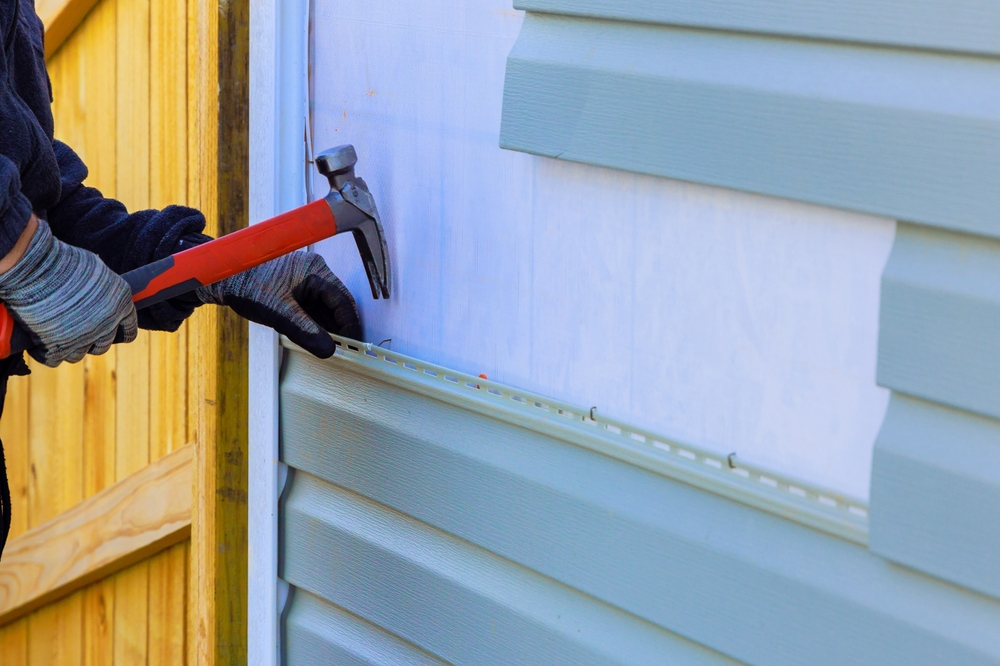
When selecting types of James Hardie siding, consider how the texture will interact with your chosen hue. A smooth finish emphasizes the color itself, while a textured finish emphasizes the material.
Tips for Choosing the Right Color for Your California Home
Ready to make a choice? Here is a step-by-step guide to nailing the perfect shade for your Golden State abode.
1. Observe the “Golden Hour”
The light in California turns golden in the late afternoon. This warm light can drastically change how a color looks.
- Cool Grays can turn greenish.
- Beiges can turn orange.
- Whites can become blindingly bright.
- Tip: Do not pick a color indoors. Take the sample outside. Look at it at noon (harsh light) and at 5:00 PM (golden light).
2. Check Your HOA and City Guidelines
California has many historic districts and strict HOAs. A color like Iron Gray might be trendy, but if your Spanish Revival neighborhood requires “Earthen Hues,” you might be forced to repaint. Always check restrictions first.
3. Consider Your Roof
Unless you are replacing your roof, the siding must match it.
- Red Spanish Tile Roof: Stick to warm neutrals like Navajo Beige, Cobble Stone, or creamy whites. Avoid cool grays or blues, which will clash.
- Black/Dark Gray Shingle Roof: You have freedom. Arctic White, Iron Gray, and Blues all work beautifully.
- Brown Shingle Roof: Stick to earth tones like Monterey Taupe, Mountain Sage, or Khaki Brown.
4. Look at the Landscape
If your home is surrounded by dry hills, a bright blue might look out of place. If you are in a dense redwood grove, a dark gray might make the house disappear entirely into the shadows (unless that is your goal!). Choose a color that complements the dominant flora in your yard.
5. Use the “Rule of Three”
A cohesive exterior usually needs three colors:
- Body Color: The main siding color.
- Trim Color: For corners, eaves, and windows (usually lighter or darker than the body).
- Accent Color: For the front door or shutters (a place to have fun with a pop of color like red, teal, or yellow).
Conclusion: Defining Your California Dream
Your home’s exterior is a public statement. In California, where indoor-outdoor living is the norm and curb appeal is highly valued, choosing the right siding color is one of the most impactful renovations you can undertake.
Whether you are drawn to the crisp, celebrity-style look of Arctic White, the grounded nature of Mountain Sage, or the bold modernity of Iron Gray, the James Hardie ColorPlus® palette offers a shade that fits your vision. These colors aren’t just paint; they are durable, engineered finishes designed to withstand the California sun and protect your home in style.
As you explore the various types of James Hardie siding available, remember that the color is the final touch that brings the architecture to life. Take your time, get samples, and choose a shade that makes you smile every time you pull into the driveway. After all, living in California is about enjoying the view—and that includes the view of your own home.
Lock In a Free, No-Obligation Estimate
Get transparent pricing on siding, windows, or exterior repairs fast. No sales pressure. Just answers.
Get My Free Estimate