Introduction — The Art and Strategy Behind Choosing Siding Colors
Choosing a color for your home’s exterior is one of the most impactful decisions a homeowner can make. It’s a choice that lives with you for years, defining your home’s daily presence and its place in the neighborhood. This decision goes far beyond personal preference; it’s a strategic blend of art, science, and psychology that can dramatically alter your home’s character and value.
Why Your Home’s Exterior Color Is More Important Than You Think
The color of your siding is the most dominant visual feature of your home’s exterior. It sets the tone for the entire property, influencing everything from curb appeal to the perceived size and style of the house. A well-chosen color can highlight beautiful architectural details, while a poor choice can make them disappear. It’s the first thing visitors notice and the last thing you see when you arrive home—making it a fundamental part of your daily life.
How Color Affects Perception, Value, and Energy Efficiency
Color has the power to transform perception. Light colors can make a small home appear larger and more inviting, while dark colors can give it a sense of modern drama and substance. Beyond aesthetics, color choices have tangible effects. A thoughtful color palette can significantly increase a home’s resale value by appealing to a wider range of buyers. Furthermore, the science of color impacts energy efficiency; lighter shades reflect sunlight and heat, potentially lowering cooling costs in warm climates, whereas darker shades absorb it.
Trends vs. Timeless Choices — Striking the Perfect Balance
Navigating the world of exterior colors means finding a sweet spot between current trends and timeless appeal. While it’s exciting to embrace the latest styles, you also want a color that you won’t tire of and that won’t look dated in five years. The key is to understand which trends have staying power and how to incorporate them in a way that complements your home’s architecture and your personal style, ensuring long-term satisfaction.
What This Guide Covers and Who It’s For
This guide is your comprehensive resource for navigating the exciting but often overwhelming process of selecting house siding colors. We will explore color theory, current trends for 2025, and timeless palettes. We’ll cover how to coordinate siding with your roof, trim, and landscape, and discuss the practical implications of color choice, from material type to climate considerations. Whether you are building a new home, planning a major renovation, or simply dreaming of a fresh look, this guide is for any homeowner who wants to make a confident, informed, and beautiful color decision.
Understanding the Power of Siding Color
The color of your siding is not merely a decorative finish; it is a powerful tool that shapes how your home is perceived, how it feels, and how it performs. Grasping the fundamentals of color’s influence is the first step toward making a masterful selection.
How Siding Color Shapes Architecture and Style
Siding color works hand-in-hand with architecture to define a home’s style. The same house can feel completely different depending on its color. A classic Colonial painted crisp white feels historic and stately. Paint it a deep charcoal, and it becomes a bold, contemporary statement. Color can be used to accentuate or downplay architectural features. A contrasting trim color will make windows and rooflines pop, while a monochromatic scheme will create a more subtle, unified look.
The Emotional Impact of Exterior Colors on Curb Appeal
Colors evoke emotion. This psychological impact is at the heart of curb appeal. Warm, earthy tones like beige, taupe, or warm grays can make a home feel welcoming and grounded. Cool blues and greens create a sense of calm and tranquility, connecting the home to nature. Bold, dark colors project confidence, sophistication, and modern flair. The emotional response a color triggers in a potential buyer or a passerby is a direct component of its perceived value and appeal.
The Science Behind Light Reflection, Heat Retention, and Fading
Color choice has a scientific basis, particularly regarding its interaction with sunlight. This is measured by a value called LRV (Light Reflectance Value), which runs on a scale from 0 (absolute black) to 100 (pure white).
- Light Colors (High LRV): These shades reflect more light and solar radiation. This keeps the siding surface cooler, which can help reduce heat transfer into the home, potentially lowering air conditioning costs in hot, sunny climates.
- Dark Colors (Low LRV): These shades absorb more light and heat. While this can be a slight advantage in very cold climates, it can also cause the siding material itself to undergo more significant temperature swings, which can affect its longevity. Darker pigments are also historically more prone to fading from UV exposure.
The Role of Sunlight and Climate in Color Longevity
The sun is color’s biggest enemy. Ultraviolet (UV) radiation breaks down the chemical bonds in pigments, causing them to fade over time. Darker, more saturated colors—especially reds, deep blues, and blacks—tend to have more complex organic pigments that are more susceptible to UV degradation and thus fade faster than lighter, earth-toned pigments. High-quality siding materials and paints now incorporate advanced UV inhibitors to prolong color life, but the principle remains. In sun-drenched regions like California, choosing a color with proven UV resistance is paramount.
Trending House Siding Colors in 2025
Each year brings a new wave of color trends that reflect broader shifts in design, culture, and consumer desires. For 2025, the overarching themes are a return to nature, a desire for calm sophistication, and a willingness to make bold, personal statements.
Overview of Modern Color Trends and Consumer Preferences
The modern homeowner is moving away from the “safe but boring” beige of decades past. While neutrals still reign, they are becoming richer and more complex. There’s a growing confidence in using deeper, more saturated colors for the entire body of the house, not just for accents. Consumers are looking for colors that feel both current and lasting, creating a personalized haven that stands out for its refined taste.
Emerging Color Themes: Natural, Coastal, and Earth-Inspired Palettes
Three key palettes are defining 2025 trends:
- Earthy & Grounded: This includes warm, organic tones that connect the home to the landscape. Think deep mossy greens, rich terracotta, warm mushroom taupes, and muted browns. These colors feel grounding, stable, and timeless.
- Coastal Calm: Inspired by sea and sky, this palette features airy, serene hues. It includes soft, misty blues, seafoam greens, sandy whites, and gentle grays. These colors create a relaxed, breezy vibe, perfect for creating a tranquil retreat.
- Dramatic & Deep: For those looking to make a statement, dark and moody colors are at the forefront. This includes sophisticated charcoal grays, deep navy blues that are almost black, and even true black. These colors create a sense of modern drama and elegance.
Regional Favorites — What’s Popular in Northern California and Beyond
While trends are national, preferences are often regional. In Northern California, there’s a strong pull toward colors that complement the natural environment.
- In forested areas like Tahoe or the Santa Cruz Mountains, deep greens, rich browns, and dark grays help homes blend beautifully with the surrounding trees.
- Along the coast, from Monterey to Marin, classic coastal palettes of light gray, sea blue, and crisp white remain eternally popular.
- In inland areas and suburbs like Sacramento or Roseville, we’re seeing a surge in modern farmhouse palettes (white with black accents) as well as warm, earthy neutrals that harmonize with the sunny, golden landscape.
Expert Predictions for Next Year’s Top Exterior Colors
Looking ahead, design experts predict a continued love affair with complex neutrals and nature-inspired hues.
- Greens will continue to surge: From sage and olive to deep forest green, this color family is becoming a new go-to neutral.
- Warmth is returning: After years of cool grays, expect to see more warm taupes, beiges, and “greige” (a mix of gray and beige) that feel cozier and more inviting.
- Black as a staple: Once a radical choice, black siding is becoming a mainstream option for modern and transitional homes, valued for its chic, minimalist power.
Classic and Timeless Siding Colors That Never Go Out of Style
While trends come and go, some colors have an enduring appeal that transcends decades. These classic choices are popular for a reason: they are versatile, sophisticated, and provide a reliable return on investment.
Why Neutrals Like White, Beige, and Gray Dominate Exterior Design
Neutrals are the bedrock of exterior design because they are architectural chameleons. They don’t compete with the home’s structure; they enhance it.
- Classic White: Crisp and clean, white is associated with purity, simplicity, and tradition. It makes homes look fresh and bright and is the hallmark of styles like Modern Farmhouse and Greek Revival.
- Versatile Gray: From soft dove gray to bold charcoal, gray is the ultimate modern neutral. It can feel warm or cool, and it pairs beautifully with almost any accent color or material like stone and wood.
- Welcoming Beige: A warmer neutral, beige creates a friendly, inviting feel. It harmonizes well with natural landscaping and offers a softer alternative to stark white.
The Subtle Sophistication of Warm Taupe and Greige Tones
In recent years, the most sophisticated neutrals have been the “in-between” shades.
- Taupe: A blend of brown and gray, taupe is a rich, earthy neutral that feels upscale and grounded. It can lean warm or cool and provides more depth than a simple beige.
- Greige: This perfect marriage of gray and beige has been incredibly popular for its versatility. It captures the modern feel of gray and the welcoming warmth of beige, making it a nearly foolproof choice for many home styles.
Soft Pastels for Charming, Character-Filled Homes
For homes with a bit of personality and historical character, soft pastels can be a beautiful choice. These are not bright, candy-colored hues, but rather muted, dusty versions. Think pale butter yellow for a Victorian cottage, light sky blue for a coastal bungalow, or a gentle mint green for a Craftsman home. These colors add charm and a touch of whimsy without being overwhelming.
The Enduring Appeal of Blue and Green Siding Hues
Blue and green are often considered “new classics” because of their strong connection to nature.
- Blue Siding: A classic choice for coastal homes, blue can range from a light, airy sky blue to a deep, formal navy. Navy blue, in particular, has become a popular choice for a look that is both traditional and bold, often paired with crisp white trim.
- Green Siding: Sage, olive, and mossy greens blend seamlessly with natural surroundings. They create a calming, peaceful effect and are a hallmark of Craftsman and rustic-style homes. A deep forest green can feel as classic and stately as navy blue.
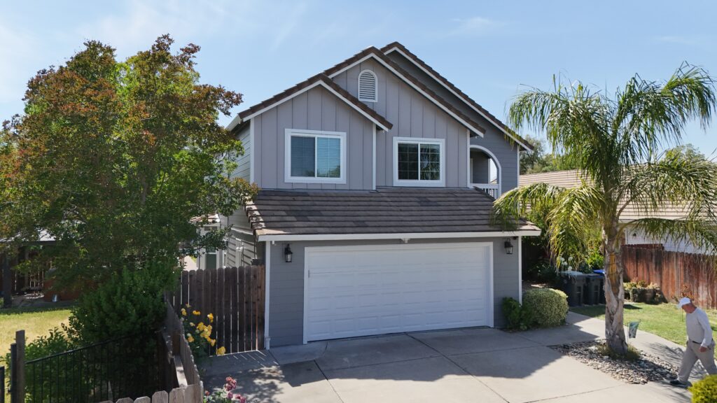
Bold and Modern Color Choices for Contemporary Homes
For homeowners with a modern sensibility, siding color is an opportunity to make a confident architectural statement. Bold, deep, and high-contrast palettes are the tools for creating a home that is striking and unapologetically contemporary.
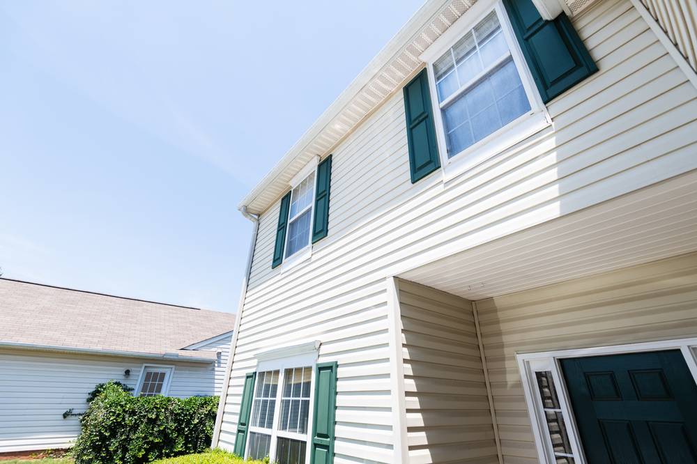
Dark Siding Tones — Charcoal, Graphite, and Midnight Black
The trend toward dark exteriors is one of the most significant shifts in residential design. These dramatic hues absorb light, which can make a home feel more substantial and grounded in the landscape.
- Charcoal Gray: A step softer than black, charcoal is a sophisticated, versatile dark neutral. It pairs beautifully with warm wood accents and metallic finishes.
- Graphite: A deep gray with a hint of metallic sheen, graphite feels industrial and chic. It’s a perfect choice for minimalist architectural designs.
- Midnight Black: The ultimate bold choice. Black siding creates a powerful, graphic statement that is incredibly modern. It makes landscaping, particularly lush greenery, pop with vibrant contrast.
Two-Tone Exteriors — Blending Contrasts for Dimension
Using two different siding colors on a home can add depth and highlight its architectural form. This often involves using a darker color on a projecting section of the house, like an entryway or a garage, and a lighter color on the main body. Another approach is to use a different color or material on the upper level of a two-story home. This technique breaks up large, flat walls and creates a custom, dynamic look.
How to Make Vibrant Accent Colors Work (Without Overpowering)
While the body of the house might be neutral, a splash of vibrant color on an accent piece can inject personality and fun. The front door is the most popular place for a bold color statement—think bright yellow, aqua blue, or fire-engine red. The key is restraint. Using a vibrant color for the front door, shutters, or even a few pieces of outdoor furniture adds a focal point without overwhelming the entire composition.
Pairing Deep Colors With Light Trims for Dynamic Contrast
One of the most effective ways to use dark siding is to pair it with a light, crisp trim. A home with black siding and bright white window trim creates a stunningly graphic, high-contrast look that feels both classic and modern. This sharp contrast defines the architectural lines of the house, making windows and rooflines stand out as intentional design elements. This is the signature look of the wildly popular Modern Farmhouse style.
Coordinating Siding Colors With Other Exterior Elements
A successful color scheme is not just about the siding; it’s about how the siding color harmonizes with all the other fixed elements of your home’s exterior. Creating a cohesive palette is key to a polished, professional look.
Roof and Siding Color Pairings — The Foundation of Harmony
The roof is the fifth wall of your house and one of its most dominant features. The siding color must coordinate with the roof color.
- Black or Charcoal Roof: This is the most versatile roof color. It works with virtually any siding color, from white and gray to blue, green, and even dark siding for a monochromatic look.
- Brown or Tan Roof: These roofs have warm undertones and pair best with warm siding colors like cream, beige, taupe, warm greens, or muted reds. Pairing a brown roof with a cool gray siding can clash.
- Gray Roof: A medium gray roof is also quite versatile, but you should pay attention to its undertones. A cool gray roof works best with cool siding colors (blues, cool grays, crisp whites), while a warm gray roof can work with greiges and warmer tones.
- Red or Green Roofs: These are less common but require careful coordination. A green roof pairs well with cream, tan, or even a contrasting barn red. A red roof often looks best with white, beige, or gray siding.
Doors, Shutters, and Window Frames — Accent Coordination Made Easy
These are your opportunities for personality. A simple rule is the 60-30-10 principle for exteriors:
- 60% Main Siding Color: This is the dominant hue.
- 30% Secondary Color: This is typically the trim color for windows, fascia, and corner boards. It should contrast or complement the main color. Classic white is a foolproof choice.
- 10% Accent Color: This is the “pop” of color for the front door and possibly shutters. It’s your chance to be bold and draw attention to the entrance.
Matching Gutters, Columns, and Railings to the Siding Palette
For a clean, integrated look, these elements should not be an afterthought.
- Gutters: Many homeowners choose to match the gutter color to the trim color (often white) for a crisp outline. Another popular option is to match the gutters to the roof color to help them blend in.
- Columns and Railings: These are typically painted in the trim color to create a cohesive and bright frame for the home and porch areas. This helps them stand out as distinguished architectural features.
The Importance of Lighting: How Natural and Artificial Light Affect Appearance
Color is not static; it changes with light. A color swatch viewed indoors will look completely different in the bright, direct sunlight of noon or the warm, angled light of sunset.
- Natural Light: View your color samples outside at different times of day—morning, noon, and late afternoon. A color can look much lighter and more washed out in direct sun. The direction your house faces also matters. A north-facing wall will receive cool, indirect light that can make colors look grayer and darker, while a south-facing wall gets intense light that can wash colors out.
- Artificial Light: Consider how your home will look at night under porch lights or landscape lighting. Warm-toned bulbs will make colors appear warmer, while cool-toned LED lights can wash them out.
Color Psychology and Its Effect on Home Perception
The colors you choose for your home send a message. Understanding the psychology behind different color families can help you craft an exterior that not only looks good but also feels right for you and communicates a specific identity.
How Color Influences Emotion and Style Identity
Colors have long-established associations that trigger subconscious emotional responses.
- White: Evokes feelings of cleanliness, simplicity, and order. It’s often associated with classicism and minimalism.
- Gray: Represents balance, sophistication, and modernity. Lighter grays feel calm and serene, while darker grays feel strong and dramatic.
- Blue: A universally liked color, blue is associated with peace, stability, and trust. It creates a calming and refreshing atmosphere.
- Green: The color of nature, green promotes feelings of harmony, health, and renewal. It connects the home to its landscape.
- Brown/Beige: Earthy and warm, these colors convey stability, comfort, and reliability. They make a home feel grounded and welcoming.
- Black: Represents power, elegance, and drama. It’s a bold, confident choice that feels distinctly modern.
The Message Behind Every Hue — From Cozy to Modern
Think about the personality you want your home to project. Do you want it to feel like a cozy, welcoming cottage? Warm beiges, soft yellows, and earthy greens will achieve that. Do you want it to look like a sleek, modern masterpiece? A palette of charcoal, black, and crisp white will send that message. Your color choice is a form of non-verbal communication about your home’s identity.
What Buyers Associate With Different Color Families
In real estate, certain colors have broader appeal. Neutral, crowd-pleasing colors are often seen as a “safe” bet for resale. Buyers often associate:
- Light Neutrals (White, Light Gray, Greige): A “blank canvas,” move-in ready, and well-maintained.
- Dark Neutrals (Navy, Charcoal): Sophisticated, upscale, and design-forward.
- Earthy Tones (Sage Green, Taupe): Calm, peaceful, and connected to nature.
- Bold/Unusual Colors: A potential project. While a unique color might appeal to a niche buyer, it can deter others who see it as something they will have to immediately spend money to change.
Choosing Colors That Reflect Your Personality and Lifestyle
Ultimately, you are the one who will live in your home every day. While resale value is a consideration, your personal satisfaction is paramount. If a deep green siding color makes you feel happy and at peace every time you pull into your driveway, that has immense value. Choose a color that reflects your personal style and the lifestyle you want to cultivate in your home.
Considering Your Home’s Architecture
The most successful color schemes are those that honor the home’s architectural style. Certain palettes are historically tied to specific designs, and using them as a starting point is a great way to ensure a harmonious result.
Ideal Siding Colors for Colonial, Victorian, and Craftsman Homes
- Colonial: This style calls for classic, simple palettes. Crisp white or creamy off-white with black or dark green shutters is the most traditional look. Muted blues, grays, and yellows are also historically appropriate.
- Victorian: These “painted ladies” are known for their complex, multi-color schemes. The palette often includes a medium-toned body color with both lighter and darker accent colors to highlight the intricate trim, brackets, and details. Deep reds, greens, golds, and blues are common.
- Craftsman: Inspired by the Arts and Crafts movement, this style emphasizes harmony with nature. Earthy palettes are key: olive and sage greens, rusty reds, warm browns, and deep ochres, often paired with cream or dark brown trim.
Modern, Mid-Century, and Contemporary Homes — Minimalist Color Palettes
These styles are defined by clean lines, simple forms, and a connection to the outdoors.
- Modern/Contemporary: Palettes are often minimalist and high-contrast. Bright white, deep black, and various shades of gray are staples. These colors emphasize the home’s geometric form. Accents often come from natural materials like wood or metal rather than paint.
- Mid-Century Modern: This style embraces both earthy, organic colors (like mustard yellow, olive green, and pumpkin orange) and a futuristic optimism, often pairing these with natural wood and stone.
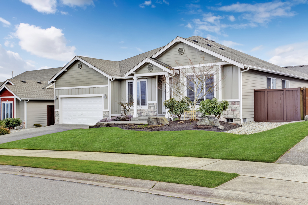
Ranch and Farmhouse Styles — Blending Rustic With Sophisticated
- Ranch: These sprawling, single-story homes look great in palettes that enhance their connection to the landscape. Warm grays, beiges, and earthy greens are excellent choices. A pop of color on the front door can add a focal point to the long facade.
- Farmhouse (Classic & Modern): The classic farmhouse is traditionally white. The Modern Farmhouse trend has popularized a high-contrast palette of bright white siding with black windows, trim, and accents. Darker bodies, like charcoal gray or navy, with white trim are also a popular modern interpretation.
Mediterranean and Coastal Homes — Warm vs. Cool Tones
- Mediterranean/Tuscan: These homes, typically stucco, call for warm, sun-baked colors. Think warm whites, creamy yellows, terracotta, and soft ochres.
- Coastal: This style is all about light and airy feelings. Cool palettes dominate: light blues, seafoam greens, sandy beiges, and, of course, crisp whites, often paired with a brightly colored front door.
Neighborhood and Environment Considerations
Your home doesn’t exist in a vacuum. Its color should feel appropriate within its larger context—the neighborhood, the natural landscape, and any local regulations.
How to Respect Local Aesthetics Without Losing Personality
Take a walk or drive around your neighborhood. What are the dominant color palettes? Is it a neighborhood of classic white Colonials, earthy Craftsman homes, or a more eclectic mix? You don’t have to copy your neighbors, but your chosen color should feel like it belongs to the same family. If most homes are neutral, a neon-yellow house will likely feel out of place. You can still show personality by choosing a more sophisticated version of a popular color or by using a unique accent color.
HOA Color Restrictions and Approval Tips
If you live in a community with a Homeowners’ Association (HOA), this is your first stop. Most HOAs have a pre-approved palette of colors for siding, trim, and doors. Straying from this list without permission can result in fines and being forced to repaint. Before you even start looking at colors, get a copy of the architectural guidelines. Submit your chosen color combination for official written approval before you purchase any materials or sign a contract.
Matching Natural Surroundings — Forest, Desert, and Coastal Regions
The most beautiful homes often look like they grew right out of their landscape.
- Forest/Wooded Areas: Deep greens, rich browns, and dark grays help a home recede into the trees, creating a peaceful, organic feel.
- Desert Regions: Colors should harmonize with the muted tones of the desert landscape. Terracotta, sand, beige, and other warm, sun-baked colors work beautifully.
- Coastal Regions: Light, airy colors reflect the sea and sky. Whites, light blues, soft grays, and sandy tones enhance the breezy, open feeling of a coastal location.
Standing Out Without Clashing — Subtle Color Differentiation
You can make your home stand out in a tasteful way. If all the homes on your street are beige, choosing a sophisticated greige or a warm white will look different but still harmonious. If many homes are light gray, opting for a deeper charcoal or a rich navy will create a memorable-yet-elegant contrast. The goal is to be distinct, not disruptive.
Siding Color by Material Type
The siding material you choose will influence your color options, longevity, and maintenance. Each material has its own unique relationship with color.
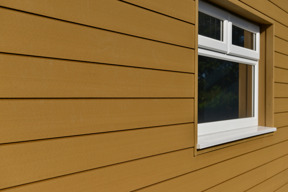
Vinyl Siding Colors — Affordable Variety and Low Maintenance
Vinyl siding offers a huge range of color options at an affordable price point. Colors are baked into the material, so they are consistent throughout the panel, which means scratches are less visible. Modern vinyl has significantly improved UV resistance, especially in lighter colors. Darker vinyl colors are available but can be more prone to fading and absorbing heat, which can cause expansion, so choosing a premium product with a strong color-fade warranty is crucial.
Fiber Cement Siding Colors — Durability Meets Design
Fiber cement is arguably the king of color. It comes in two main options: pre-primed, ready for you to paint any color you can imagine, or with a factory-applied, baked-on finish. These factory finishes (from brands like James Hardie) are extremely durable, multi-coated, and come with long warranties against fading, chipping, and peeling (often 15 years). This gives you a vibrant, long-lasting color with minimal maintenance. The range of factory colors includes everything from timeless neutrals to deep, saturated modern hues.
Wood Siding Colors — Natural Texture and Warmth
Wood offers two beautiful options: paint or stain. Paint can be any color and offers a protective layer, but it will eventually need to be scraped and repainted. Stain, on the other hand, soaks into the wood, celebrating its natural grain and texture. Stains can be semi-transparent to allow the wood grain to show through or solid for a more uniform color. The beauty of wood is its natural warmth, but it requires the most maintenance to keep its color looking fresh.
Metal Siding Finishes — Sleek, Industrial, and Modern Options
Steel and aluminum siding come with durable, factory-applied finishes. The color palette is often more focused on modern and industrial aesthetics, including various shades of gray, white, black, and sometimes bold colors like red or blue. These finishes are very resistant to fading and chalking. Some premium metal siding can also mimic the look of wood or patinated metals like zinc or copper.
Engineered Wood and Composite — Customizable and Eco-Friendly Choices
Similar to fiber cement, engineered wood siding comes either pre-primed or with a durable factory finish. The color options from manufacturers are extensive, covering a wide range of popular neutrals, earthy tones, and dark modern shades. These products are designed to offer the look of real wood with greater color stability and less maintenance.
Brick and Stone Pairings — Coordinating Complementary Hues
If your home has partial brick or stone, this is a fixed element that must be coordinated with. Pull colors from the stone or brick for your siding choice. For example, if your stone has flecks of gray and brown, a greige or taupe siding will be harmonious. If you have classic red brick, siding in cream, beige, or a dark charcoal can create a beautiful contrast. Avoid colors that will clash with the undertones of the masonry.
Practical Factors When Choosing a Siding Color
Beyond aesthetics, there are practical, real-world considerations that should inform your color decision. These factors can affect your budget, your long-term maintenance workload, and your home’s comfort.
Local Climate: Heat Reflection and UV Resistance
As discussed earlier, color choice impacts heat absorption. In hot, sunny climates like much of California, a lighter color with a high LRV can contribute to a cooler home and potentially lower energy bills. In these same climates, UV resistance is the most important factor for color longevity. Choosing a material with a premium, warranted finish will protect your investment from fading and chalking under the intense sun.
Maintenance Requirements Based on Color Intensity
- Light Colors: Tend to show dirt, dust, and mildew more readily, so they may require more frequent washing to look their best. However, they are more forgiving when it comes to fading.
- Dark Colors: Hide dirt well but are more susceptible to fading from UV exposure. They also show imperfections like scratches or salt spray (in coastal areas) more clearly. Repainting a dark color can also be more labor-intensive.
Resale Value and Long-Term Market Appeal
If you plan to sell your home in the next 5-10 years, resale value should be a key consideration. Neutral, widely appealing colors are the safest bet. A survey by the National Association of Realtors found that homes with neutral exteriors tend to sell for more than homes with highly specific or bold colors. A classic white, gray, or greige allows potential buyers to easily envision themselves living there without factoring in the cost of a new paint job.
Visualizing the Final Look With Digital Design Tools
It’s incredibly difficult to imagine how a tiny 2×2 inch color swatch will look across your entire house. Thankfully, technology can help. Most major siding manufacturers (and professional contractors like Heritage Exteriors) offer online visualizer tools. You can upload a photo of your own home and “try on” different siding colors, trim colors, and even roofing options. This is an invaluable step to ensure you love the final combination before committing.
Multi-Tone and Accent Strategies for Dynamic Exteriors
A single siding color can be beautiful, but a thoughtful multi-tone strategy can elevate your home’s exterior from standard to stunning. It’s the key to creating architectural depth and personality.
Using a Three-Color Palette (Base, Trim, and Accent)
The classic three-color scheme is a designer’s secret weapon.
- Base (or Body) Color: This is the main siding color and covers the largest area.
- Trim Color: This secondary color is used for window and door frames, fascia, corner boards, and railings. It’s usually a contrasting color (like white against a dark body) to outline the home’s architecture.
- Accent Color: This is the third color, used sparingly for a pop of interest. It’s almost always reserved for the front door and sometimes shutters.
Accent Walls and Gables for Added Depth
For homes with distinct architectural features like gables or bump-outs, using a different color or material in these areas can add incredible dimension. A popular technique is to use horizontal lap siding on the main body and then switch to board-and-batten or shingle siding in the gables, often in a slightly darker or lighter shade of the main color. This creates a subtle, sophisticated texture and visual interest.
Mixing Textures and Finishes for Visual Interest
Color isn’t the only way to create contrast. Mixing textures can be just as effective. Consider pairing smooth fiber cement lap siding with a section of textured stone veneer around the base of the home or on the entryway columns. Combining sleek metal panels with the warmth of natural wood accents is another hallmark of modern design. This interplay of materials makes a home feel custom and high-end.
When and How to Use Contrasting Colors Confidently
High contrast is a powerful tool. The most common and effective use is pairing a dark body color (charcoal, navy) with a crisp white or off-white trim. This creates a sharp, graphic look that defines the home’s lines. The reverse is also true—a white body with black window frames and trim is a hugely popular modern farmhouse look. The key is to commit fully and ensure the contrast is intentional and clean.
Expert Tips for Visualizing and Testing Colors
Choosing a color from a small swatch is a recipe for anxiety. Follow these professional tips to visualize your choice accurately and make a decision with confidence.
How to Use Online Siding Visualizer Tools Effectively
These tools are your best friend. When using them, be sure to try your color combinations with roof and trim colors that match your actual home. Play with different options. Save your favorite combinations and compare them side-by-side. While these tools are fantastic, remember they are a simulation. The colors on your screen can vary, so this should be a starting point, not your final decision.
Comparing Swatches in Natural Light
This is the most critical step. Once you’ve narrowed your choices down to two or three, get the largest samples you can—ideally, actual pieces of siding or large painted boards. Place them against your home’s exterior wall. Look at them at different times of day:
- Morning: The light is clear and bright.
- Noon: The direct overhead sun can wash colors out.
- Late Afternoon/Evening: The warm, angled light will change the color’s character.
Check them on different sides of the house (e.g., the sunny side vs. the shady side) to see how the color behaves in different lighting conditions.
Seasonal and Weather Considerations During Color Selection
The season in which you choose your color can affect your perception. The bare branches of winter create a different backdrop than the lush green of summer. A gray color might look beautiful on a sunny day but dreary under an overcast sky. Try to visualize your chosen color in all seasons. If possible, look at your samples on both sunny and cloudy days to get the full picture.
Consulting Color Professionals and Home Designers
If you are still feeling uncertain, don’t hesitate to seek professional help. A color consultant or an experienced exterior designer can provide invaluable guidance. They are trained to see undertones and understand how colors work together with architecture and light. A professional contractor like Heritage Exteriors often has extensive experience helping homeowners in your specific area, like Northern California, choose colors that are both beautiful and well-suited to the local style and climate.
Common Mistakes to Avoid When Selecting Siding Colors
A beautiful result is as much about avoiding mistakes as it is about making good choices. Be aware of these common pitfalls.
Ignoring Architectural Integrity or Roof Compatibility
Forcing a color palette onto a home that doesn’t match its architectural style is a frequent error. A minimalist black-and-white scheme might look jarring on an ornate Victorian, just as a complex multi-color palette would look out of place on a simple Ranch home. Even more common is forgetting the roof. A beautiful cool gray siding will almost always clash with a warm brown roof. The roof color is a non-negotiable part of the equation.
Overusing Bright or Trendy Colors
Trends are fun, but they are also fleeting. What looks cutting-edge today might look dated tomorrow. It’s generally safer to use timeless, neutral colors for the main body of the house—the most expensive part to change—and save the trendier or brighter colors for the front door or shutters, which are much easier and cheaper to repaint if you get tired of them.
Failing to Consider Lighting and Orientation
A homeowner falls in love with a soft greige sample in the store, only to find it looks stark white on their sun-drenched, south-facing house. Or they choose a beautiful deep blue, which then looks almost black on their shady, north-facing wall. Ignoring the powerful effect of natural light is one of the biggest and most disappointing mistakes. Always test colors on the actual walls of your home.
Neglecting Trim and Accent Harmony
A great siding color can be let down by a poor trim choice. The trim is what frames the picture. Choosing a trim color with the wrong undertone, or one that doesn’t provide enough contrast, can make the whole project feel flat and “off.” Think of the siding, trim, and accent colors as a complete system that must work together.
Maintenance, Longevity, and Fading Prevention
Your siding color is an investment. Taking steps to protect it will ensure it looks beautiful for years to come.
Why Some Colors Fade Faster Than Others
As mentioned, the pigments used to create colors have different levels of stability when exposed to UV radiation. Organic pigments, which are often used to create vibrant reds, blues, and yellows, are generally less stable than the inorganic mineral pigments used for earthy tones, whites, and grays. This is why a red front door will show fade faster than a beige house.
UV-Resistant Coatings and Protective Treatments
To combat fading, manufacturers have developed advanced coatings. Premium factory-finished siding, like that on fiber cement or composite products, involves multiple layers of paint that are cured or baked on for extreme durability. These finishes contain high-quality pigments and advanced UV inhibitors that provide the best possible defense against fading, often backed by warranties of 15 years or more.
Cleaning and Repainting Tips to Preserve Vibrancy
Regular cleaning does more than just remove dirt; it removes pollen, algae, and pollutants that can stain or damage the finish over time. A gentle annual wash is the best preventative maintenance you can do. When it’s time to repaint, proper preparation is key. The surface must be perfectly clean and dry. Use a high-quality primer and two top coats of a premium 100% acrylic latex exterior paint for the best adhesion and color retention.
How to Extend the Lifespan of Your Siding’s Color
- Choose a Quality Material: Invest in a siding product known for its color retention, like factory-finished fiber cement.
- Select Lighter Colors: If you live in a very high-UV environment, lighter colors will naturally show less fade over time.
- Perform Regular Cleaning: Wash your siding annually to remove damaging contaminants.
- Manage Landscaping: Keep trees and shrubs trimmed back from the house to prevent abrasion and moisture buildup.
Eco-Friendly and Sustainable Color Options
For the environmentally conscious homeowner, color choice extends to the sustainability of the products used. It’s possible to have a beautiful home that is also gentle on the planet.
Low-VOC Paints and Green Manufacturing Standards
When painting siding (like primed fiber cement or wood), choose paints labeled “Low-VOC” or “Zero-VOC.” Volatile Organic Compounds are harmful chemicals that off-gas into the atmosphere. Many modern paints offer excellent durability with much safer formulas. Also, look for siding manufacturers who prioritize sustainable practices, like water conservation and waste reduction in their factories.
Reflective and Energy-Efficient Color Technologies
Some manufacturers now offer siding and paint with special reflective pigments. These “cool” technologies can reflect infrared light (which is perceived as heat) even in darker colors. This allows you to have the look of a dark, modern color without the full heat-absorption penalty, helping to keep your home cooler and reduce energy costs.
Sustainable Siding Materials With Long-Lasting Finishes
One of the most sustainable choices you can make is to choose a product that lasts a very long time, reducing the need for replacement. Durable materials like fiber cement and metal, which have lifespans of 50 years or more, are inherently sustainable. A long-lasting factory finish that doesn’t need frequent repainting also reduces the consumption of paint and resources over the home’s life.
Eco-Label Certifications to Look For When Choosing Siding
Look for products with third-party certifications. The GREENGUARD Gold certification, for example, indicates that a product has met rigorous standards for low chemical emissions. Recycled content is another factor to consider; many metal and engineered wood siding products use a significant percentage of recycled materials.
Energy Efficiency and Climate Performance
The color you paint your house has a direct, measurable impact on its energy performance, especially in climates with significant heating or cooling seasons.
How Color Affects Home Temperature and Energy Bills
A study by the Lawrence Berkeley National Laboratory found that using cool, reflective colors on a home’s exterior and roof can lead to significant energy savings. In sunny, warm climates, a reflective exterior can reduce cooling energy demand by 10-20%. By absorbing less heat, the siding stays cooler, and less of that heat is transferred through the walls into your living space, meaning your air conditioner doesn’t have to work as hard.
Light vs. Dark Colors — Heat Reflection and Absorption Explained
The science is simple:
- Light-colored surfaces have a high albedo (reflectivity) and reflect a large portion of the sun’s energy.
- Dark-colored surfaces have a low albedo and absorb a large portion of the sun’s energy, converting it into heat.
Think of a black car versus a white car on a sunny day. The same principle applies to your home. A dark-colored wall can get significantly hotter than a light-colored wall, sometimes by 30-40°F or more.
Smart Siding for Different Regions (Hot, Cold, Humid, or Dry)
- Hot/Sunny Regions (e.g., Sacramento, CA): Lighter colors are the smartest choice from an energy perspective. White, beige, light gray, or soft pastels will help keep the home cooler.
- Cold/Overcast Regions: The penalty for using a dark color is much lower. In fact, a dark color can provide a very minor passive solar heating benefit in the winter, though this is usually negligible compared to the home’s overall insulation. Here, color choice can be driven more by aesthetics.
- Humid/Dry Regions: The humidity level doesn’t directly impact color choice, but it does impact material choice. In humid areas, a material resistant to mold and mildew is key, regardless of color.
Combining Insulated Siding With Reflective Colors
For the ultimate in energy performance, you can combine two powerful strategies: insulated siding and a reflective color. Insulated siding has a layer of rigid foam insulation bonded to the back, which increases the wall’s R-value and reduces energy loss. Topping this with a light, reflective color creates a super-insulated, heat-reflecting wall system that offers maximum energy savings in both hot and cold weather.
Frequently Asked Questions About House Siding Colors
Here are answers to some of the most common questions homeowners have when choosing siding colors.
Can I Choose Any Color I Want for My Siding?
Theoretically, yes, especially if you are using a paintable material like fiber cement or wood. However, your choice may be limited by your siding material’s available colors (for vinyl or factory-finished products) and, most importantly, by any HOA regulations in your neighborhood.
What Should I Consider When Picking My Color?
You should consider five key things: 1) your home’s architectural style, 2) your roof color, 3) your neighborhood context and any HOA rules, 4) your local climate, and 5) your personal taste.
Can I Mix Multiple Siding Colors?
Yes! Mixing colors and materials is a popular trend. You can use one color for the body and another for the gables, or pair siding with stone or brick. The key is to ensure the colors are harmonious and the placement feels intentional and balanced.
Does Siding Color Fade Over Time?
All exterior colors will fade to some degree over time due to UV exposure. However, the rate of fading depends on the color’s intensity (dark colors fade faster) and the quality of the siding’s finish. Premium, factory-applied finishes offer the best fade resistance.
Can Color Affect Energy Efficiency?
Absolutely. Lighter colors reflect more solar heat, which can help keep your home cooler and reduce air conditioning costs in warm climates. Darker colors absorb more heat.
How Can I Visualize My Home’s Potential Color Scheme?
The best way is to use an online visualizer tool to try on different colors digitally. After that, it is essential to get large physical samples and test them on your actual house at different times of day.
Can I Repaint or Change My Siding Color Later?
It depends on the material. Wood, fiber cement, and engineered wood can all be repainted. Vinyl siding is not designed to be painted, and while some specialty paints exist, it can be a risky process that may void your warranty. If you think you might want to change your color in the future, choose a paintable siding material.
Where Can I Find Reliable Inspiration and Tools?
Look at siding manufacturer websites, shelter magazines, Pinterest, and home design blogs. Drive around neighborhoods you admire. And most importantly, consult with a professional exterior remodeling company. They can provide samples, design advice, and access to visualization tools.
Pros and Cons of House Siding Colors
Every color decision involves a trade-off. Weighing the pros and cons can help you make a balanced choice.
Advantages — Customization, Appeal, and Longevity
The right color choice allows for complete customization of your home’s look. It can dramatically boost curb appeal and resale value. And when you choose a high-quality, long-lasting finish, it’s a decision that provides beauty and protection for decades.
Disadvantages — Overcommitment, Fading, and HOA Restrictions
Color is a long-term commitment. A bold, trendy choice might feel exciting now but could lead to “color regret” later. All colors face the challenge of fading. And for many, the biggest constraint is the pre-approved and often limited palette offered by their HOA.
Evaluating the Balance Between Personality and Resale Value
This is the central dilemma for many homeowners. The key is to find a “personally-neutral” color. This might be a more complex or sophisticated version of a classic neutral—like a deep, earthy green instead of beige, or a rich navy instead of light gray. These colors have personality but are still broadly appealing.
How to Avoid Color Regret
The best way to avoid regret is through diligent testing. Never, ever choose a color from a small chip under fluorescent store lighting. Use visualizers and large, physical samples outdoors, analyze colors in all types of light, and consult with experts if you’re unsure. Taking these extra steps ensures you’ll love your home’s siding color for years to come.