In distinguished communities like Danville, San Ramon, and Alamo, a home’s exterior is more than a protective shell; it is a statement of quality, elegance, and sophisticated design. While architectural style and landscaping are paramount, the single most impactful element influencing a property’s curb appeal is its color palette. The right combination of colors can elevate a home’s perceived value, highlight its finest architectural features, and create a powerful first impression that resonates with the discerning tastes of the market. Choosing a palette is not merely about picking a favorite color; it is a strategic design decision that can transform a beautiful home into a truly exceptional one.
At Heritage Exteriors Siding & Windows, we provide expert exterior color consultation Danville homeowners trust to navigate this crucial process. We understand that in high-value markets, color is a language. It communicates a standard of luxury and meticulous care. This guide explores the trending and timeless palettes that enhance luxury homes, the principles of sophisticated color selection, and the expert strategies required to create curb appeal that endures.
Unlock Your Home’s True Curb Appeal Potential
The right color palette is an investment in your home’s beauty and value. Our design experts specialize in creating sophisticated exterior color schemes for luxury properties in Danville and beyond.
Schedule Your Complimentary Color Consultation Today!
Why Color Choice Matters for Luxury Home Exteriors
The selection of an exterior color palette is one of the most critical and least expensive ways to dramatically impact a home’s value and aesthetic presence. In upscale neighborhoods, where architectural integrity and pristine presentation are expected, the colors you choose are subject to a higher level of scrutiny. They have a profound psychological impact on how a property is perceived by neighbors, visitors, and potential buyers.
Psychological Influence of Exterior Colors
Colors evoke emotions and create subconscious associations. A well-conceived palette can make a home feel welcoming, stately, modern, or serene, while a poor choice can make it feel dated, jarring, or cheap.
- Warm vs. Cool Palettes: Warm colors (creams, beiges, taupes) tend to feel welcoming, comforting, and classic. Cool colors (grays, blues, crisp whites) often feel more modern, serene, and sophisticated. The key is selecting a nuanced version of these colors that avoids feeling generic.
- Contrast and Balance: The level of contrast between the body, trim, and accent colors dictates how architectural details are perceived. High contrast (e.g., a dark body with light trim) sharply defines lines and can create a bold, graphic statement. Low, tonal contrast (shades of the same color) creates a softer, more monolithic, and often more contemporary look.
- Perceived Size and Scale: Light colors tend to make a home appear larger and more expansive, while dark colors can make it feel more substantial, grounded, and sometimes more intimate. Color can be used strategically to correct perceived proportional issues or to emphasize a home’s grand scale.
The Relationship Between Color and Perceived Value
In luxury markets, certain palettes are associated with high-end design. Sophisticated, complex neutrals, deep and dramatic charcoals, and harmonious, nature-inspired tones signal a level of design intentionality that elevates a property. A palette that looks thoughtfully curated and is in pristine condition suggests that the entire home has been maintained to an equally high standard. Conversely, colors that are overly bright, dated (e.g., 1980s pink-beiges), or poorly coordinated can instantly lower a home’s perceived value, regardless of its size or location. Neighborhood harmony is also a factor; while you don’t need to copy your neighbors, a palette should feel like it belongs in its premium setting, contributing to the overall aesthetic quality of the community.
Popular Exterior Color Trends in Danville and San Ramon
While classic palettes are always in style, several distinct trends are defining the look of luxury home exterior colors in the Danville and San Ramon areas. These trends focus on sophistication, complexity, and a connection to the region’s natural beauty.
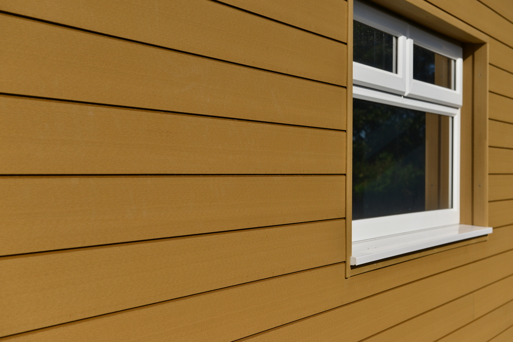
Nuanced Neutrals (Warm Whites, Taupes, Greiges)
The all-white or beige home has been elevated. Today’s popular neutrals are far more complex and interesting.
- Warm Off-Whites: Instead of stark, sterile white, the trend is toward creamy, warm whites with subtle undertones of beige or gray. These colors feel soft, luminous, and incredibly chic. They provide a clean canvas that pairs beautifully with natural materials like wood and stone, and they make landscaping pop.
- Taupes and Greiges: These are sophisticated chameleon colors. “Greige” is a blend of gray and beige, while taupe leans slightly more toward brown. They offer more depth and character than a simple beige but are warmer and more inviting than a cool gray. These complex neutrals shift beautifully with the changing light of day.
Deep Charcoals and Blacks with Wood/Metal Accents
For a bold, contemporary statement, nothing is more striking than a dark and dramatic palette.
- Charcoal, Near-Black, and Deep Navy: Painting the body of a home in a deep, saturated color creates a powerful, modern aesthetic. It’s a confident choice that feels custom and high-design. These dark colors create a stunning backdrop for architectural details and landscape lighting.
- The Importance of Accents: The key to making a dark palette work is the introduction of warmth and texture through accents. A garage door, front door, or soffits finished in a warm, natural wood tone provides a critical organic counterpoint to the dark siding. Black metal accents—window frames, railings, light fixtures—complete the look, adding another layer of sleek, contemporary texture.
Soft, Earthy Palettes Aligned to Local Landscapes
Inspired by the golden hills and majestic oaks of the region, these palettes aim to connect the home directly to its natural surroundings. They consist of muted, complex colors drawn from nature, such as olive green, dusty sage, warm stone gray, and deep bronze. These palettes are particularly effective for homes situated on larger lots with mature landscaping, creating a seamless and harmonious transition between the built and natural environments.
Classic Combinations That Enhance Architectural Lines
Beyond trends, certain color strategies are timeless because they effectively highlight a home’s architecture. The allocation of color to the body, trim, and accents is a powerful tool for this.
Neutrals with Bold Accents
This is a classic and foolproof strategy for adding personality while maintaining elegance.
- Allocation: The main body of the house is painted in a sophisticated neutral—a warm white, a soft greige, or a medium gray. The trim is typically a crisp, clean white or a slightly lighter version of the body color to create a defined but not jarring outline.
- The Accent: The “wow” factor comes from the accent color, which is reserved for a single, high-impact element: the front door. A deep navy, a glossy black, a rich burgundy, or even a vibrant-but-deep teal on the front door acts as a welcoming focal point and a powerful statement of style.
- When to Use: This strategy works on almost any architectural style, from traditional to contemporary. It’s a way to be classic and safe on the main body while allowing for a personalized, easily changeable pop of color.
Monochrome Elegance for Modern Designs
For modern and contemporary architecture, a tonal, low-contrast palette can be incredibly sophisticated.
- Allocation: This approach involves using different shades of the same color. For example, the body of the house might be a medium gray, the trim a slightly lighter gray, and architectural panels or other features a deep charcoal. This lack of sharp contrast emphasizes the home’s form, massing, and volume rather than its individual lines.
- Texture as a Key Element: In a monochrome scheme, texture becomes even more important. The subtle difference between smooth siding, rough stone, and sleek metal—all in shades of gray—creates a rich, layered, and highly sophisticated look.
- When to Use: This strategy is best suited for contemporary homes where the architectural form itself is the main statement. It creates a serene, unified, and gallery-like feel.
How Lighting and Landscape Affect Color Perception
A color chip viewed indoors will look completely different on the exterior of your home. The unique conditions of your specific property are the most critical factor in color selection.
- Sun Exposure and Orientation: A color will appear much lighter and potentially more washed-out on a sun-drenched, south-facing wall than it will on a shaded, north-facing wall. A gray that looks perfectly neutral on the swatch might reveal a strong blue undertone in the cool morning light or a purple undertone in the evening.
- Seasonal Changes: The quality of light changes dramatically between the low, warm sun of winter and the high, intense sun of summer. The surrounding foliage also changes, from the bare branches of winter to the lush green of spring. A good color choice will look beautiful in all seasons.
- Nighttime Lighting: How does the color look under your landscape and security lighting? Warm-toned lighting can significantly alter the appearance of cool-toned paints.
- Surrounding Materials: The color of your roof (which is a huge block of color), your stone or brick accents, and your pavers or driveway will all reflect onto your siding and influence its perceived color. A gray siding will look warmer next to a red brick chimney.
- The Golden Rule: Sample On-Site: Never make a final decision from a small chip. Paint large sample boards (at least 2×2 feet) with your potential colors and move them around the property at different times of day. View them in direct sun, in shade, next to your trim, and next to your stone. This is the only way to be certain you will love the final result.
Recommended Paint Finishes and Coatings for Longevity
The sheen, or finish, of your paint affects both its appearance and its durability.
- Matte/Flat Finish: This finish has no shine and provides a soft, velvety look that is excellent at hiding minor imperfections in the siding. It’s a popular choice for the main body of modern homes. However, it can be less resistant to scuffs and stains than higher-sheen paints.
- Eggshell/Satin Finish: These are the most popular and practical choices for the body of a home. They have a low, elegant lustre that offers better durability and cleanability than a flat finish without being overly shiny. A satin finish holds up very well against the elements and is a workhorse for
Danville exterior color palettes. - Semi-Gloss Finish: With its noticeable shine, semi-gloss is highly durable and easy to clean. It is almost always reserved for trim, doors, and shutters. The sheen highlights these details and provides a crisp contrast to the lower sheen of the body.
- UV and Fade Resistance: In sunny inland areas like Danville, investing in a high-quality paint with excellent UV resistance is non-negotiable. Premium paints contain more durable pigments and binders that resist fading and chalking, dramatically extending the life of your paint job and protecting your investment.
Coordinating Siding, Trim, and Roof Colors
Creating a harmonious palette requires coordinating the three main color masses of your home: the siding (body), the trim, and the roof.
- Start with the Fixed Element: The roof is the most permanent and expensive element to change. Therefore, it should be your starting point. Identify its color and, more importantly, its undertone (cool, with blue/gray/black tones, or warm, with brown/red/tan tones).
- Match Undertones: Your siding and trim colors should share the same undertone as your roof for a cohesive look. Pairing a cool gray siding with a warm brown roof will almost always clash.
- Balance Dark and Light: A common strategy is to create a “color sandwich.” If you have a dark roof, choosing a lighter body color and dark trim can look balanced. If you have a light roof, a medium-to-dark body color can feel grounded. The goal is to avoid having everything be the same value (all light or all dark), which can look flat.
- Homes with Stucco and Siding: For homes that mix materials, you can either treat them as a single body color for a unified look or use a different shade for each to highlight the architectural change. A common approach is to use a slightly darker shade on the lower material (like stucco) and a lighter shade on the upper siding to create a sense of lightness.
Avoiding Common Color Selection Mistakes
- Stark White Overload: A brilliant, pure white can look glaring and cheap in bright sunlight. Opt for softer, more complex off-whites.
- Clashing Undertones: This is the most common mistake—pairing a pink-beige with a green-gray, for example. Identify and match undertones in all your fixed elements.
- Too Many Accents: In most cases, one accent color (for the front door) is enough. Using multiple, competing accent colors can create a chaotic, “circus wagon” effect.
- Ignoring HOA Guidelines: Before you fall in love with a palette, be sure to review your community’s specific HOA Covenants, Conditions, and Restrictions (CC&Rs). Many have pre-approved color palettes.
- High-Gloss Overkill: Using a high-gloss finish on the body of a home is a major misstep. It highlights every imperfection and looks plastic. Reserve gloss for the front door only, if at all.
Digital Tools and Visualizers for Testing Combinations
Many paint manufacturers and siding companies offer online visualizer tools that allow you to upload a photo of your home and “paint” it with different colors. These tools can be incredibly helpful for the initial phase of narrowing down your choices. They allow you to quickly see the difference between a light body/dark trim scheme and a dark body/light trim scheme. However, they should be used with caution. The colors on a computer screen are not an accurate representation of how the paint will look in real life. Use visualizers to explore broad ideas, then use that information to select a handful of colors to sample in the real world.
Real-World Examples from Danville Luxury Homes
Scenario 1: The Modern Mediterranean
- The Home: A large, two-story home with a tile roof, smooth stucco, and arched windows.
- The Goal: Update the dated peachy-beige palette to something more current and sophisticated.
- The Palette: The body was painted a soft, warm white. The trim and garage doors were painted a deep, warm bronze-charcoal (instead of the typical brown) to add modern contrast. The front door was finished in a rich, dark wood stain. The result is a palette that respects the home’s architecture but feels fresh, clean, and undeniably luxurious.
Scenario 2: The Contemporary Craftsman
- The Home: A newer construction home in a Craftsman style with a mix of fiber cement shingles and lap siding.
- The Goal: Create a palette that feels both classic and bold.
- The Palette: The main body lap siding was painted a deep charcoal gray. The shingles in the gables were done in a slightly lighter medium-gray to create subtle, tonal contrast. The substantial trim, fascia, and porch columns were painted a crisp, creamy off-white, creating sharp lines. The front door provided a powerful pop of deep red. The palette feels grounded, substantial, and custom-designed.
Scenario 3: The Classic Ranch on a Wooded Lot
- The Home: A sprawling single-story ranch home in Alamo, surrounded by mature oak trees.
- The Goal: Choose a color that would harmonize with the natural setting.
- The Palette: The body was painted in a complex, muted green-gray that changes with the light. The trim was a soft, warm beige rather than a stark white, creating a gentle contrast. The front door and shutters were painted a deep, near-black color for a touch of classic elegance. The home now feels perfectly integrated with its beautiful, high-value landscape.
Expert Help Choosing Colors That Increase Curb Appeal
Choosing the perfect exterior color palette for a high value home curb appeal project is both an art and a science. It requires a trained eye, a deep understanding of color theory, and knowledge of how materials and light interact in the real world. An experienced design professional can save you from a costly mistake and help you find a palette that you will love for years to come.
The design team at Heritage Exteriors Siding & Windows specializes in creating sophisticated color palettes for luxury homes in Danville, San Ramon, and the surrounding communities. We consider your home’s architecture, its lighting, your personal style, and the latest design trends to create a custom scheme that maximizes curb appeal and value. To learn more about our comprehensive siding and design services, please visit our main installation page.
Define Your Home’s Elegance with a Professional Color Palette.
A sophisticated color scheme is the ultimate finishing touch for a luxury home. Let our design experts guide you to the perfect choice.